Lecture 16
Epidemic spreading
2025-04-24
Motivation

Motivation

Motivation

Measuring disease progression (individual)

Measuring disease progression (inter-individual)
- Serial Interval
- Time between symptom onset in a primary case and symptom onset in a secondary case
- Generation Time
- Time between infection in a primary case and infection in a secondary case
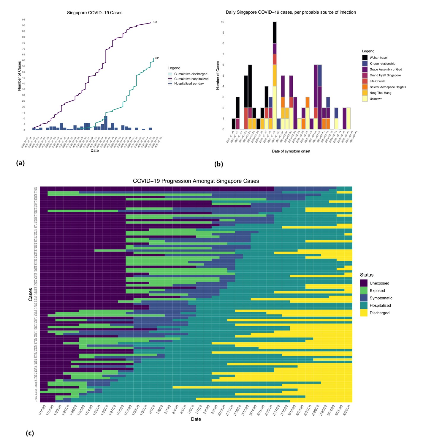
Figure from [3]: (a) Daily hospitalized cases and cumulative hospitalized and discharged cases. (b) Daily incidence with probable source of infection. (C) Disease timeline, including dates at which each case is unexposed, exposed, symptomatic, hospitalized, and discharged. Not all cases go through each status as a result of missing dates for some cases.
Measuring disease progression (population-level)
- Basic Reproduction Number: \(R_0\)
- Average number of infections produced by a primary case in a fully susceptible population
- Force of Infection
- Rate at which susceptible individuals become infected.

Measuring disease progression (population-level)
- Infection dynamics change over time (i.e. distinction between \(R_0\) vs. \(R_{eff}\))
Uncertainty in Epidemiology
- Answer: Models!
- Models can estimate unknown information (like \(R_0\)) from noisy observations
- With these parameters, models can predict infection dynamics in a modelled population
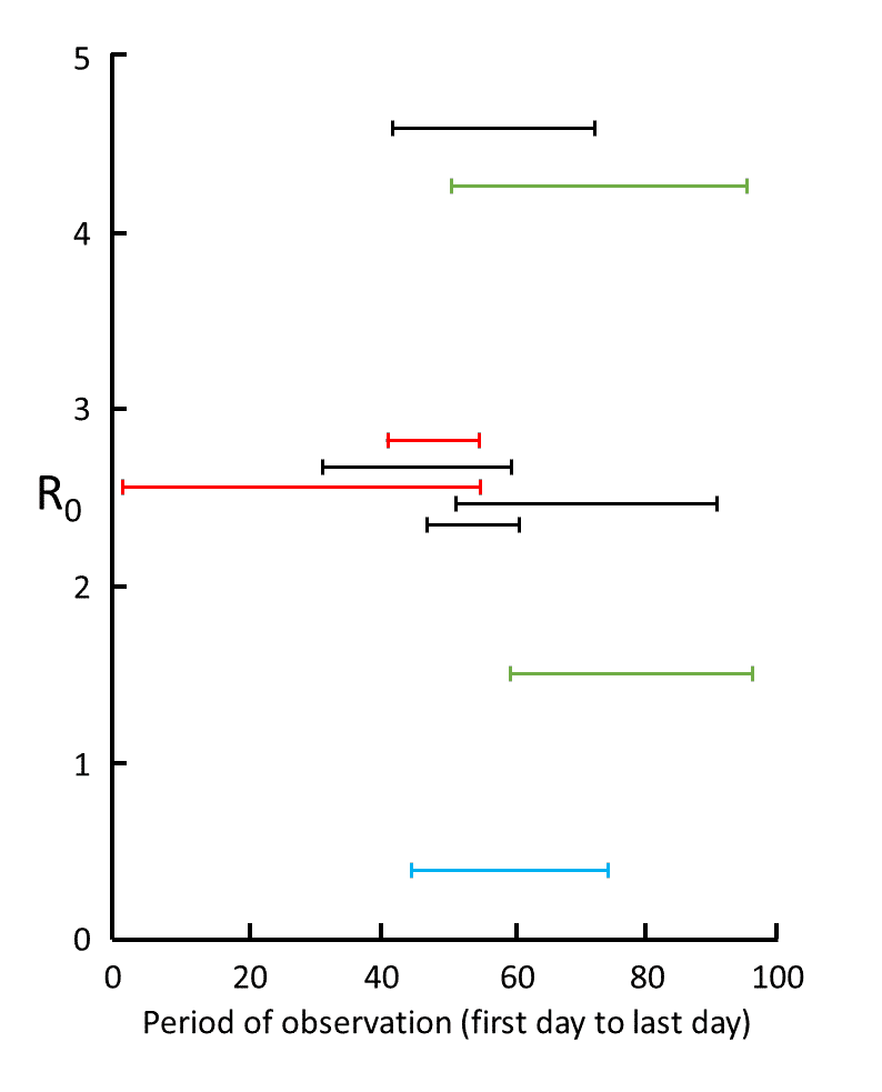
Figure from [4]: Nine estimates of \(R_0\) in studies for which information was given about the time over which the measurements were made, from 1 December (day 1) to 6 March (day 97); the data are from studies in mainland China (red), Wuhan (black), Shenzhen (blue), and South Korea (green); the results show the large degree of variability in mean estimates, attributable to variations in the quality of the data and the models used; however, five of the results cluster around 2.6
Example: Field Epidemiology
00203-5/asset/952ce95e-00e5-481f-b100-d537dc0bce38/main.assets/gr1_lrg.jpg)
- Remember: Epidemiological data itself is generated through a complex network of physcial infrastructure and human resources
Figure from [5]: Distribution of Plasmodium falciparum cases and gold price in Guyana, 2007–19(A) Time series of P falciparum malaria cases in Guyana by month (grey) and detrended gold price per month (yellow). (B) Distribution of P falciparum cases between 2007 and 2019 by age group and sex in mining regions (regions 1, 7, 8, and 10). (C) Monthly proportion of malaria cases (represented by red points) in non-resident men and boys in gold mining regions aged between 15 and 50 years by gold price quartile rank. Boxplots represent mean and range between the 2·5th and 97·5th percentiles.
Example: Diamond Princess Cruise Ship


- Unique natural experiments (like an isolated cruise ship) are a source of epidemiological data with lower uncertainty which can inform parameter estimates for transmission models.
Basic epi modelling: SIR
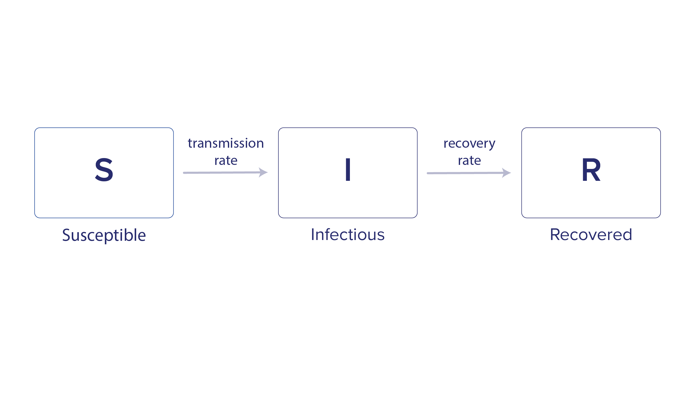
- Once we have estimates for the parameters of the infectious process we want to model, we can model transmission as transitions between compartments: S (Suscepible), I (Infectious), R (Removed)
Basic epi modelling: SIR


- In this model \(\beta\) is transmission rate, \(\gamma\) is recovery rate, and \(R_0 = \frac{\beta}{\gamma}\)
Less basic epi modelling: SEIR model

- Model structure is dictated by characteristics of a disease.
- Here: S (Suscepible), E (Exposed), I (Infectious), R (Removed)
- For example, COVID-19 had a non-infectious latent period prior to a case becoming infectious.
Less basic epi modelling: metapopulation SIR model

From [6]
- Every population has its own infection process (defined by a compartmental model), populations are connected by migration flows
Metapopulation model with empirical migration flows

Figure from [7]: Spatial density distribution of places collected by SafeGraph across the whole United States; the visualization is created using the DataShader package, Python 3.7.
Metapopulation model with empirical migration flows

Figure from [8]: Travel networks of people and parasites between settlements and regions. (A) Average monthly travel between regions (nodes), with edges weighted by volume of traffic. For clarity, the top 50% of routes are shown with arrows indicating the direction of movement (humans or parasites) from a primary settlement to a visited settlement. (B) Average monthly parasite importation by returning residents, by region. (C) Average monthly parasite importation by visitors, where importation is only considered if the destination is receptive to onward transmission.
Metapopulation SIR model with intra-patch demographically stratified contact structure
Figures from [9]: LHS x2 - The empirical matrices collected from contact surveys, modelled synthetic contact matrices, and the scatter plots of the entries in the observed (x-axis) and modelled (y-axis) contact matrices are presented. The correlation between the empirical and synthetic matrices are shown. The matrices are normalised such that its dominant eigenvalue is 1. RHS - Mean number of contacts and basic reproduction number between rural and urban settings.
Behavioral data in epidemic modelling

Figure from [10]: Key to more integrated modelling is multidisciplinary collaboration among epidemiologists, clinicians, social scientists, mathematical modellers, RCCE practioners and members of communities directly affected by disease. Through a design process, the team decides on research questions and modelling frameworks to address the research or programmatic questions. The design process should involve a conscious effort to let questions of the greatest relevance to affected communities and first responders drive decisions about modelling approaches, which may be based on extensions of existing methods or warrant novel formulations. Assessment of the parameters needed with awareness of the data available could generate knowledge about data gaps to be filled through field studies or could result in new mathematical formulations. Explicitly incorporating behaviour would enable assessment of the epidemiological impact of less conventionally investigated interventions, such as RCCE. All outcomes warrant accountability in terms of sharing results with stakeholders and affected communities. The process should be iterative with rigorous testing and validation practices. S, susceptible; E, exposed; I, infected; R, recovered.
Behavioral data in epidemic modelling

From [11]
- Behavioral data (familiar to us in CUS) can fill in gaps in knowledge about:
- Structure of social contacts
- Behavioral response to disease transmission
- Adherence to NPIs
Figure from [11]: a) Over the course of the epidemic, mobile phone data and applications may be relevant to help answer a number of important epidemiological questions needed to guide the implementation and evaluation of various interventions. b) However, these data should be considered in light of ownership and use biases that may or may not limit generalizability to the overall population. Mobile phone owners and users only represent a subset of the population and may have additional age (shown here for a synthetic population for illustrative purposes), socio-demographic, or geographic biases. Applications that require the use of a smartphone or application may further limit the generalizability of these data since they represent smaller subsets of the user population.
Applications: Predicting transmission in cities

Figure from [8]: Local analysis of source-sink anomalies. (A) Source outliers and (B) sink outliers. Settlements are colored by their outlier rank (from low values in blue to high values in red) and sized according to Rc, an indicator of receptivity. (C) The ratio of estimated localized importation to malaria cases at clinics around Nairobi. A topographic map of the city was from National Geographic, and the Economic and Social Research Institute’s geographic information system highlights the national park, commercial, and residential areas.
Sidenote: infection characteristics and spatial structure of transmission

Figure from [12]: The incubation period impacts the predictability of disease spread. Longer incubation periods have lower overlap (predictability) in the first 50 d (A). Over time, the predictability decreases (B), with longer incubation periods consistently having lower predictability.
Anticipating health system vulnerability
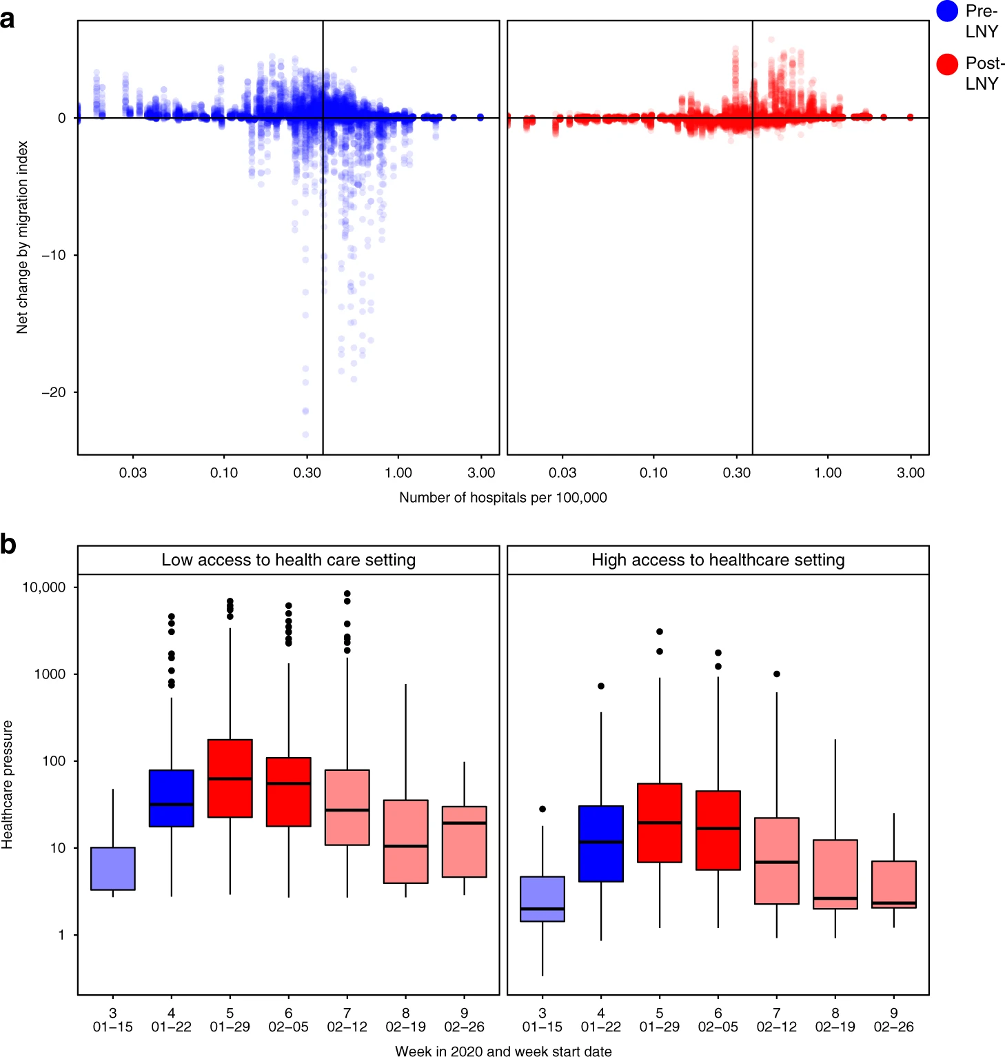
Figure from [13]: a) The changes in traveller volume before (blue) and after (red) LNY. Net change is defined as inbound migration index minus outbound migration index. Thus, a negative change indicates more travellers leave than arrive while a positive value indicates more travellers arrive than leave. A solid line indicates the median level of healthcare capacity. b) The changes in the healthcare pressure (log10 scale) related to COVID-19 each week in low and high healthcare capacity prefectures. Healthcare capacity is measured by the number of hospitals per 100,000 residents (nlow = 157, nhigh = 153). Healthcare pressure is measured by confirmed COVID-19 cases divided by healthcare capacity. Darker shade represents weeks when low healthcare capacity settings experienced significantly higher pressure than high healthcare capacity settings; lighter shade represents when differences are not statistically significant based on Mann–Whitney U test (5% type I error rate). The comparison for week 7 has p-value = 0.06. The boxplots in panel b display Median, IQR and whiskers +/− 1.5 times IQR.
Monitoring social contact patterns

From [14]: A schematic describing the spatial scales of mobility measured using mobile phone calling data (map, above) and indicating what associated infectious disease data might look like (time course, below). Using mobile phone CDRs, an individual subscriber’s location can be geolocated on the tower level (far right); however, this may be difficult to use in conjunction with the locations and timings of individual cases, given highly sporadic incidence. These mobility and infectious disease data can be aggregated to larger spatial areas, such as those between administrative units (middle panel), where patterns of incidence may resolve into clearer outbreaks, as, for example, when lags between outbreaks might map onto the flow of many individuals between larger spatial units.
Monitoring the effect of NPIs

From [15]
From [15]: Mobility indicators in different settings. Change in mobility indicators in different settings relative to the census data. Mobility indicators have been smoothed with a 30 day moving average for display. Shaded areas indicate the timing of national lockdown interventions in England. The first and third lockdowns were ended in phases. The end of both shaded areas indicates the date of the beginning of phased reopening of schools: first lockdown 1 June 2020, third lockdown 8 March 2021.
Monitoring the effect of NPIs


From [16]
Understanding disparate impacts of epidemic control policies
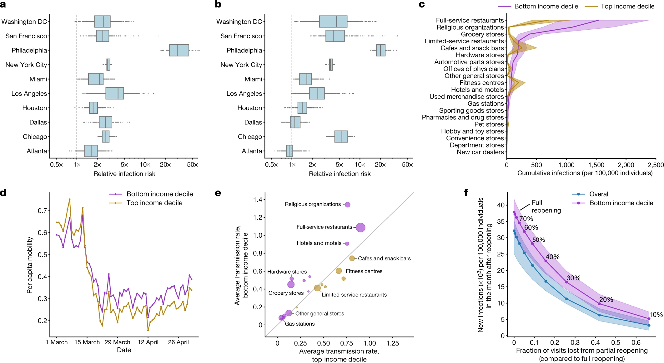
From [17]: a, In every metro area, our model predicts that people in lower-income CBGs are likelier to be infected. b, People in non-white CBGs area are also likelier to be infected, although results are more variable across metro areas. c, The overall predicted disparity is driven by a few POI categories such as full-service restaurants. d, One reason for the predicted disparities is that higher-income CBGs were able to reduce their mobility levels below those of lower-income CBGs. e, Within each POI category, people from lower-income CBGs tend to visit POIs that have higher predicted transmission rates. f, Reopening (at different levels of reduced maximum occupancy) leads to more predicted infections in lower-income CBGs than in the overall population In c–f, purple denotes lower-income CBGs, yellow denotes higher-income CBGs and blue represents the overall population.
Limitations of behavioral data for epidemic response

From [18]: LHS – Estimated SafeGraph coverage rates against age and race for North Carolina 2018 general election. Each point displays a ventile of poll location by age (top) and race (bottom). The blue lines depict LOESS smoothing on the individual poll locations. RHS - Intersectional coverage effects by race and age. The top panel presents the coverage rate by quartiles of age on the x-axis and race on the y-axis. The bottom panel plots the coverage rate on the y-axis against percentage of nonwhite voters at the polling location on the x-axis for older polling locations (yellow) versus younger polling locations (blue) for ventiles of poll location by race. (Lines display linear smoothing of the individual poll locations.) Coverage is lowest among older minority populations and highest among younger whiter populations.
Limitations of behavioral data for epidemic response
00214-4/asset/53e126c0-6562-43b3-95d6-abf3a5927fd3/main.assets/gr1_lrg.jpg)
00214-4/asset/ad1619ed-2fa7-4a71-827b-a6efbded5961/main.assets/gr3_lrg.jpg)
From [19]: LHS – Counties included in the study by their NCHS category (A) and the number of observations of counties with at least 100 cases with available estimates, by state and epidemiological week (B). RHS - Simple correlation between estimated Rt and modelled Rt with the prediction variance of the fully specified model for each subset of NCHS category.
Sidenote: Privacy, edge computing, decentralization
- Advances in privacy technologies have the potential to remove or re-balance tradeoffs between Respect for persons and Public interest
- Federated (distributed) computing could compute epidemiologically relevant measures on individual mobile devices.
- Local differential privacy or secure aggregation protocols could achieve population-level insights from private individual data.
