require(terra)
url <- "https://data.worldpop.org/GIS/Population/Global_2000_2020_1km_UNadj/2020/CHN/chn_ppp_2020_1km_Aggregated_UNadj.tif"Lab 1-1 - Crash course on GIS with R
Objective
In this lab, we will be introduced to geographical information and how to process, analyze, and visualize it. In particular:
- We will understand the different types of geographical information.
- What are the different formats to store that information
- How to use
Rand some libraries to deal with that information. - How to process geographical data
- How to analyze geographical data
- How to visualize geographical data.
Geographical Information Systems
There are many platforms to analyze geographical data. They are commonly known as GIS (Geographical Information Systems).
You can find a list of those platforms in the Wikipedia Page about GIS
Some important examples:
- ESRI products, including the famous ArcGIS that contains both online and desktop versions (commercial).
- QGIS (Quantum GIS), a free and open-source alternative to ArcGIS
Of course,
Rcan also be used as a GIS.- We can find a list of libraries to do spatial statistics and visualization at the Task View for Spatial Statistics
- There are mainly two categories:
- Libraries to treat spatial data in vector format, like
sf. - Libraries to treat spatial data in raster format, like
terra. - Libraries for visualization, like
leaflet, ormapview.
- Libraries to treat spatial data in vector format, like
- Same in
python, which integrates very well with ArcGIS Python wiki GIS
Types of geographical data
There are three types of geographical data:
Raster data
Raster data is a geographical data format stored as a grid of regularly sized pixels along attribute data. Those pixels typically represent a grid cell in specific geographical coordinates.
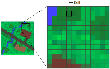
Typical geographical data in raster format comes from continuous models, satellite images, etc. For example, pollution, nightlights, etc.
The most used format for raster data is GeoTIFF (
.tif). Stores geospatial information (such as coordinates, projection, and resolution) and pixel values.More information about raster data here.
Basemaps
Basemaps are a particular case of raster images. They are images of maps used as a background display for other feature layers.
The primary sources of base maps is satellite images, aerial photography, scanned maps, or composed maps. For example, the maps you see in Google Maps, Open Street Maps, Carto, or MapBox are tiles of basemaps at different zooms
When looking at a map, the basemaps used are typically referenced in the bottom-right corner.

Vector data
Vector data represents geographical data using points, lines, curves, or polygons. The data is created by defining points at specific spatial coordinates. For example, lines that define a route on a map, polygons that define an administrative area, or points that geolocate a particular store entrancetrance of a store.
Vector data is stored and shared in many different formats. The most used is the ESRI Shapefile (
.shp), GeoJSON (.geojson), KML (Keyhole Markup Language, .kml) or GeoPackage (.gpkg).The Shapefile format, which consists of multiple files with different extensions, like
.shp(geometry),.shx(shape index), and.dbf(attribute data) is one of the oldest and most widely recognized standards, supported by most GIS software and, of course, libraries inRandpython.GeoJSON is a text-based format derived from JSON, making it easy to integrate into web mapping libraries and APIs.
Libraries to work with raster data
The most prominent and powerful library to work with raster data in R is terra. It can also work with vector data, but its main strength is raster data.
Let’s see an example. WorldPop is an organization that provides spatial high-resolution demographic datasets, like population. It is widely used, especially in areas where the census data is not very good. Estimations of the population are done using official data, satellite images, and other data.
Get the raster for the estimated number of people in China at a resolution of 30 arc seconds (approximately 1km at the equator). Link here
- Load the data
r <- rast(url)In case of a slow connection, the data is also in the /data/CUS directory:
fname <- paste0("/data/CUS/labs/1/",basename(url))
r <- rast(fname)- Let’s see what is in it:
rclass : SpatRaster
dimensions : 4504, 7346, 1 (nrow, ncol, nlyr)
resolution : 0.008333333, 0.008333333 (x, y)
extent : 73.55708, 134.7737, 16.03292, 53.56625 (xmin, xmax, ymin, ymax)
coord. ref. : lon/lat WGS 84 (EPSG:4326)
source : chn_ppp_2020_1km_Aggregated_UNadj.tif
name : chn_ppp_2020_1km_Aggregated_UNadj
min value : 0.0
max value : 285422.8 - And visualize it. To do that, we need the package
tidyterrato work with rasters inggplot.
require(tidyverse)
require(tidyterra)
ggplot() +
  geom_spatraster(data=r+1) +
  scale_fill_whitebox_c(
    palette = "muted",
    breaks = c(0,10,100,1000,10000,100000,1000000),
    guide = guide_legend(reverse = TRUE),
    trans = "log"
  ) +
labs(fill="Population") 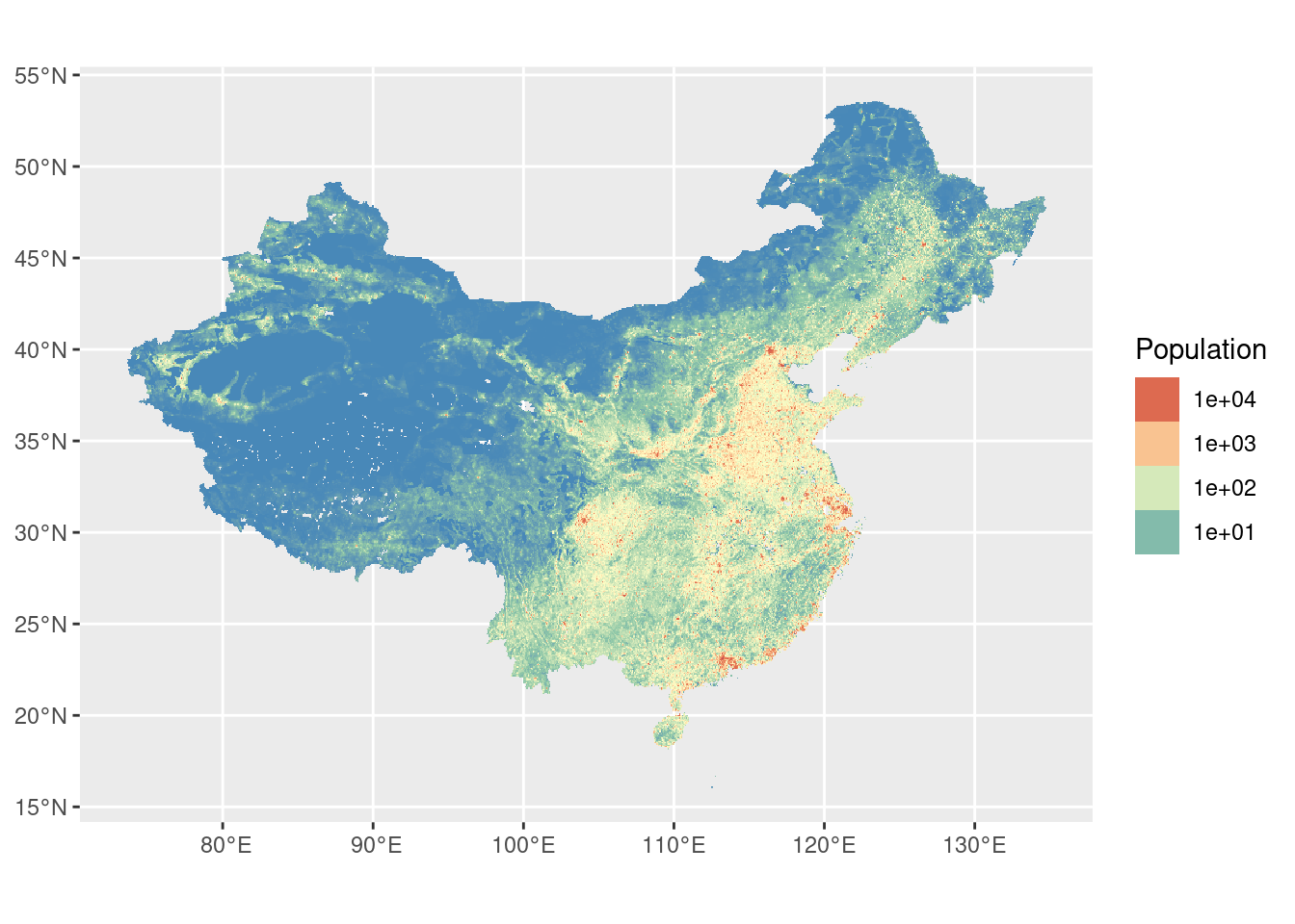
Exercise 1
The Atmospheric Composition Analysis Group at WashU publishes different measures of pollution at one of the smallest resolutions available (0.01º \(\times\) 0.01º) using different chemical and atmospheric models, satellite images, and ground datasets (see [1]).
- Navigate to the webpage of rasters from the group WashU Satellite-derived PM2.5.
- Find the monthly mean total component PM\(_{2.5}\) at 0.01º \(\times\) 0.01º in the US in NetCDF format. Use the V5.NA.04.02 version. NetCDF is a general array-oriented data, similar to GeoTiff.
- Download the data for February, March, and April 2020. Do you see any difference?
The data is already downloaded in the /data/CUS folder
r2020Feb <- rast("/data/CUS/labs/1/V5NA04.02.HybridPM25.NorthAmerica.2020-2020-FEB.nc")
r2020Mar <- rast("/data/CUS/labs/1/V5NA04.02.HybridPM25.NorthAmerica.2020-2020-MAR.nc")
r2020Apr <- rast("/data/CUS/labs/1/V5NA04.02.HybridPM25.NorthAmerica.2020-2020-APR.nc")
Libraries to work with vector data
In R the library sf is the most widely adopted package for handling, manipulating, and visualizing vector data. It offers a modern, “tidyverse-friendly” interface, making integrating spatial data operations within standard R workflows straightforwardly.
The older sp package also supports vector data but sf has become the go-to solution due to its more intuitive syntax and built-in functions.
Let’s see an example. The U.S. Census Bureau provides county boundaries in a zipped shapefile format through their TIGER geographical service. We’ll download that file, unzip it to a temporary directory, and then read it into R as an sf object.
- Download the 20m resolution of county boundaries from the 2020 U.S. decennial Census on a temporal directory and unzip in the data directory.
url <- "https://www2.census.gov/geo/tiger/GENZ2020/shp/cb_2020_us_county_20m.zip"
temp_dir <- tempdir()
zip_file <- file.path(temp_dir, "us_counties.zip")
download.file(url, zip_file, mode = "wb")
unzipdir <- "./temp"
unzip(zip_file, exdir = unzipdir)
Again, in case of slow connection we have already the data in the course directory
unzipdir <- "/data/CUS/labs/1/cb_2020_us_county_20m/"- Have a look a the files in the directory
list.files(unzipdir)[1] "cb_2020_us_county_20m.cpg"
[2] "cb_2020_us_county_20m.dbf"
[3] "cb_2020_us_county_20m.prj"
[4] "cb_2020_us_county_20m.shp"
[5] "cb_2020_us_county_20m.shp.ea.iso.xml"
[6] "cb_2020_us_county_20m.shp.iso.xml"
[7] "cb_2020_us_county_20m.shx" - Load the data in
Rusingsf
require(sf)
counties <- st_read(dsn = unzipdir)
Reading layer `cb_2020_us_county_20m' from data source
`/data/CUS/labs/1/cb_2020_us_county_20m' using driver `ESRI Shapefile'
Simple feature collection with 3221 features and 12 fields
Geometry type: MULTIPOLYGON
Dimension: XY
Bounding box: xmin: -179.1743 ymin: 17.91377 xmax: 179.7739 ymax: 71.35256
Geodetic CRS: NAD83- What’s in the object we have just read?
counties |> head()Simple feature collection with 6 features and 12 fields
Geometry type: MULTIPOLYGON
Dimension: XY
Bounding box: xmin: -102.8038 ymin: 30.99345 xmax: -74.76942 ymax: 45.32688
Geodetic CRS: NAD83
STATEFP COUNTYFP COUNTYNS AFFGEOID GEOID NAME NAMELSAD
1 01 061 00161556 0500000US01061 01061 Geneva Geneva County
2 08 125 00198178 0500000US08125 08125 Yuma Yuma County
3 17 177 01785076 0500000US17177 17177 Stephenson Stephenson County
4 28 153 00695797 0500000US28153 28153 Wayne Wayne County
5 34 041 00882237 0500000US34041 34041 Warren Warren County
6 46 051 01265782 0500000US46051 46051 Grant Grant County
STUSPS STATE_NAME LSAD ALAND AWATER geometry
1 AL Alabama 06 1487908432 11567409 MULTIPOLYGON (((-86.19348 3...
2 CO Colorado 06 6123763559 11134665 MULTIPOLYGON (((-102.8038 4...
3 IL Illinois 06 1461392061 1350223 MULTIPOLYGON (((-89.92647 4...
4 MS Mississippi 06 2099745602 7255476 MULTIPOLYGON (((-88.94335 3...
5 NJ New Jersey 06 923435921 15822933 MULTIPOLYGON (((-75.19261 4...
6 SD South Dakota 06 1764937243 15765681 MULTIPOLYGON (((-97.22624 4...- The
sfobject incountieslooks like a table. Each row contains a feature that can be a point, line, polygon, multi-line, or multi-polygon.- The geometry (vector) of each feature is in the
geometrycolumn. - The rest of the columns are metadata for each of the features. In our case, we have the name of the county, the State where the county is, or the U.S. Census internal ID (
GEOID) and many others.
- The geometry (vector) of each feature is in the
- We can work with
sfobjects like with any other table inR. For example, here is the map of the counties in the mainland US, excluding the states of Alaska, Puerto Rico, and Hawaii.
counties |> filter(!(STUSPS %in% c("AK","PR","HI"))) |>
  ggplot() + geom_sf()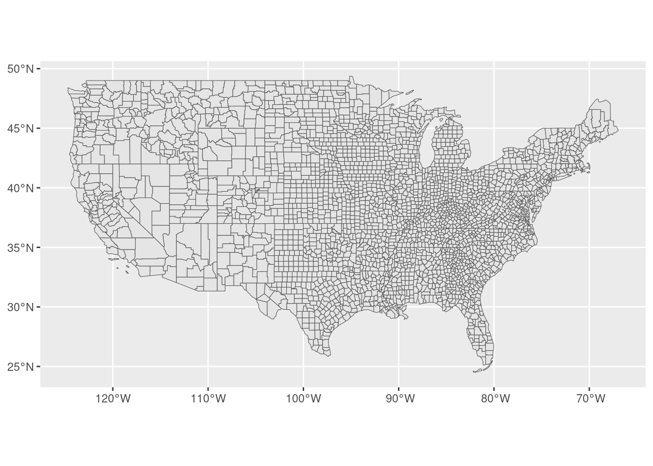
- Another way to get these vector data from the census is the superb
tidycensuslibrary, which gives us the geometry of each county and some demographic information about them. For example, let’s get the median household income and population by county and their geometry. Note thegeometry = TRUEat the end to get the vector shape of the counties.
require(tidycensus)
vars <- c(medincome = "B19013_001", pop = "B01003_001")
counties_income <- get_acs(geography = "county",
                           variables = vars,
                           year = 2021,
                           output = "wide",
                           geometry = TRUE,
                           progress_bar = FALSE)
We will come back to the use of tidycensus in the following labs.
Exercise 2
Another source of vector data is the Open Street Map (OSM). OSM is a collection of APIs where we can download roads, points of interest (POIs), buildings, polygons, routes, and many more. In R we can download data from OSM using the fantastic osmdata package.
For example, let’s download the highways around the Boston area
- First, we define a bounding box around Boston
library(osmdata)
bbx <- getbb("Boston, MA")- Or, if you have the coordinates of any specific area, you can use:
bbx <- st_bbox(c(xmin=-71.28735,xmax=-70.900578,ymin=42.24583,ymax=42.453673))- OSM contains many layers (look at their maps!), like rivers, highways, POIs, etc. You can find a comprehensive list of them here or by using:
available_features() |> head()[1] "4wd_only" "abandoned" "abutters" "access" "addr" "addr:city"- Let’s see how many of them are related to highways.
available_tags("highway") |> head()# A tibble: 6 × 2
Key Value
<chr> <chr>
1 highway bridleway
2 highway bus_guideway
3 highway bus_stop
4 highway busway
5 highway construction
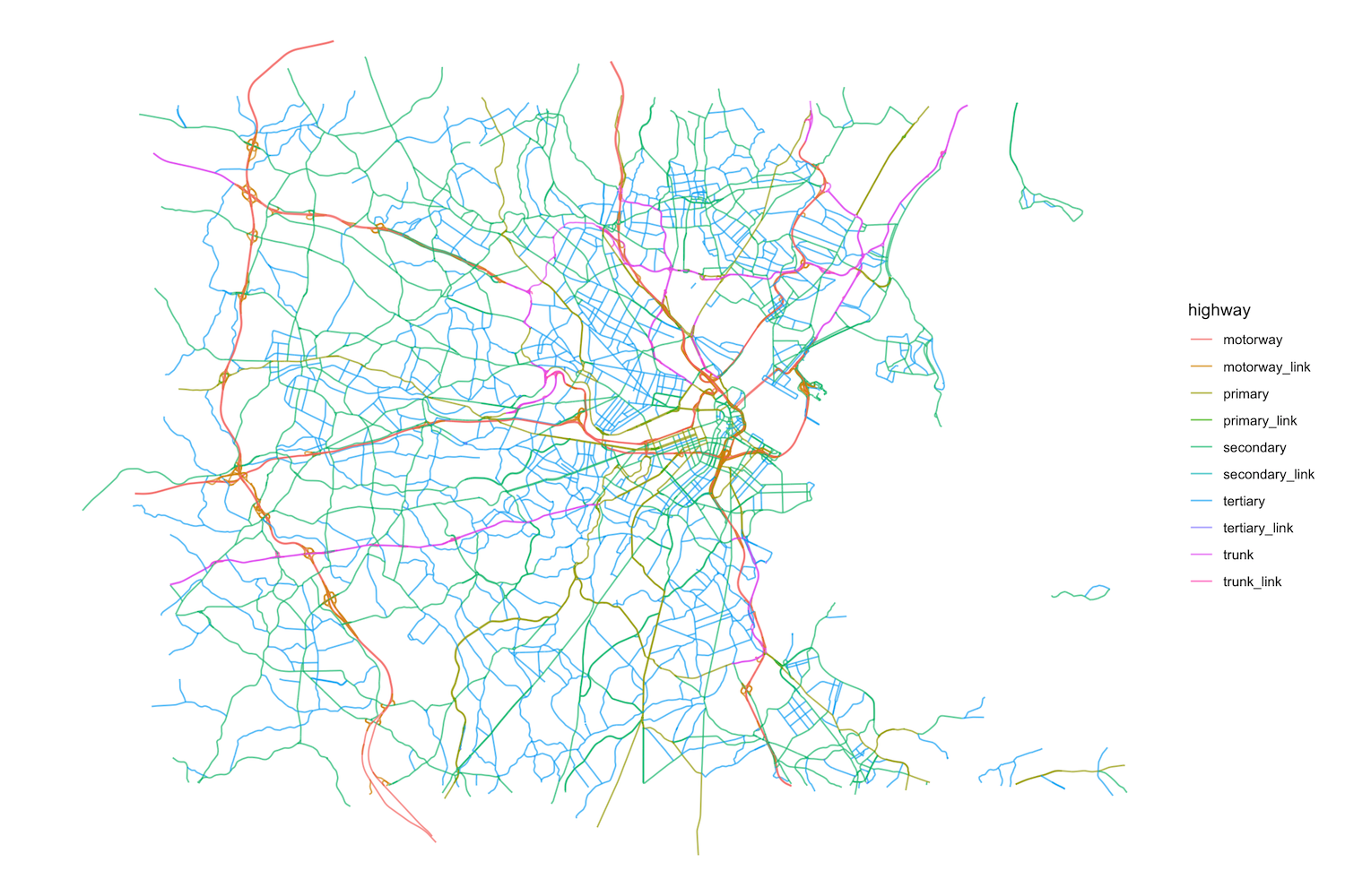
6 highway corridor - There are a lot of them, but the main ones are
motorway,trunk,primary,secondary,tertiarythat distinguish between highways and other roads connecting cities or small towns. Let’s collect them:
highways <- bbx |>
  opq()|>
  add_osm_feature(key = "highway",
                  value=c("motorway", "trunk",
                          "primary","secondary",
                          "tertiary","motorway_link",
                          "trunk_link","primary_link",
                          "secondary_link",
                          "tertiary_link")) |>
osmdata_sf()- Because vector data about highways might come as points, polygons or lines, we have the three tables in the
highwaysobject:
highways |> print()- Let’s select the
linesand plot them by type of road
ggplot() +
  geom_sf(data = highways$osm_lines,
          aes(color=highway),
          size = .4,
          alpha = .65)+
  theme_void()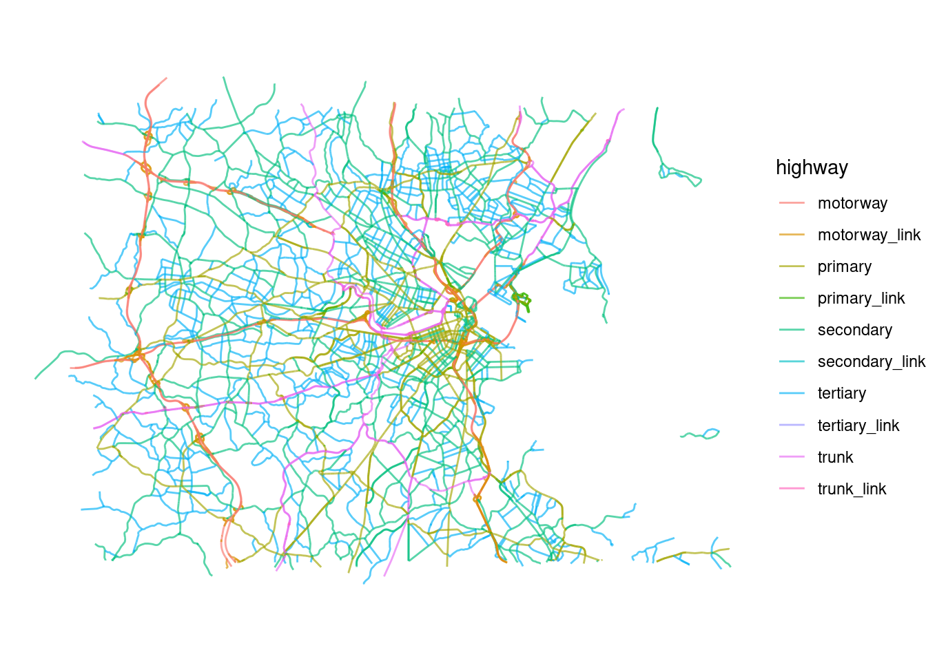
With that information:
Use
osmdatato download also some POIs (restaurants) from OSM in the Boston area and visualize them (only the points).Use
osmdatato download the parks from OSM in the Boston area and visualize them (only the polygons).
Libraries to work with basemaps
Finally, the other type of important of geographical information is basemaps. Basemaps are usually in raster or image format and compile information about a geographical area as a picture. The primary sources of basemaps are satellite images, aerial photography, scanned maps, or composed maps. For example, the maps you see in Google Maps.
There are many APIs to retrieve those maps, including Google Maps, OSM, Stadia Maps, Carto, Mapbox, and many others. Those APIs return tiles which are static images of those maps at different zoom (resolutions). Most of those services require an API Key.
There are many libraries to download those basemaps/tiles from different APIs, like the library
ggmap. However, since we typically will need basemaps to show data on top, we are going to show a more dynamic way to access them through libraries likeleafletormapview. Also, those libraries do not require setting an API key.In those libraries, corresponding basemaps will be automatically downloaded from one of those APIs to match our geographical data.
For example, let’s visualize our county’s data set on a basemap. Let’s start with the library
leaflet, which is also “tidyverse-friendly” but without basemap. Note that only the polygons are shown
counties_MA <- counties |> filter(STUSPS=="MA")
require(leaflet)
counties_MA |> leaflet() |> addPolygons()- Also note that the map is interactive: you can zoom in and move around. Let’s add the basemap by default (OSM):
counties_MA <- counties |> filter(STUSPS=="MA")
require(leaflet)
counties_MA |> leaflet() |> addTiles() |> addPolygons()- We can also use other providers. For example, this is the famous Positron basemap:
counties_MA <- counties |> filter(STUSPS=="MA")
require(leaflet)
counties_MA |> leaflet() |> addProviderTiles(provider=providers$CartoDB.Positron) |> addPolygons()- Another similar library to visualize dynamical geographical information + basemaps is
mapview
require(mapview)
mapview(counties_MA)- Those libraries allow to visualize many different layers on top of each other. We will return to these libraries and their visualization options at the end of the lab.
Geographical projections
The values in geographical data refer to geographical coordinates. To do that, we need a geographical projection, that is, a method for transforming Earth’s 3d surface onto a two-dimensional 2d plane. Each projection involves compromises since no flat map can perfectly preserve all geographical properties (area, distance, shape, direction) at one.
Projections are defined by the Coordinate Reference Systems (CRS), which specify how latitude and longitude relate to a particular mathematical model of the Earth. And yes, there are many mathematical models of the Earth, because it is not a sphere but rather an ellipsoid.
- The most used CRS is the standard WGS84 (EPSG:4326) based on a referenced ellipsoid.
Other popular projections are
- Web Mercator (EPSG:3857) used for online maps like in Google Maps, OSM and others.
- North American Datum (NAD 83, EPSG: 4269).
The EPSG Geodetic Parameter Dataset contains a registry of those spatial reference systems, earth ellipsoids. Funny story, it was initiated by the European Petroleum Survey Group (EPSG) in 1985. Each coordinate system has a number (e.g., 4326, 3857).
Important: Different map projections can produce varying coordinate values for the same exact location on Earth. Thus, it is essential to know the projection of our data. Most errors in using geographical information come from using different geographical projections.
We can use
sflibrary to get the geographical projection of our datasets. For example,countiesfrom the U.S. Census comes in the NAD83 format
st_crs(counties)Coordinate Reference System:
User input: NAD83
wkt:
GEOGCRS["NAD83",
DATUM["North American Datum 1983",
ELLIPSOID["GRS 1980",6378137,298.257222101,
LENGTHUNIT["metre",1]]],
PRIMEM["Greenwich",0,
ANGLEUNIT["degree",0.0174532925199433]],
CS[ellipsoidal,2],
AXIS["latitude",north,
ORDER[1],
ANGLEUNIT["degree",0.0174532925199433]],
AXIS["longitude",east,
ORDER[2],
ANGLEUNIT["degree",0.0174532925199433]],
ID["EPSG",4269]]while data from OSM and pollution is in the WGS84 standard:
st_crs(r)Coordinate Reference System:
User input: WGS 84
wkt:
GEOGCRS["WGS 84",
ENSEMBLE["World Geodetic System 1984 ensemble",
MEMBER["World Geodetic System 1984 (Transit)"],
MEMBER["World Geodetic System 1984 (G730)"],
MEMBER["World Geodetic System 1984 (G873)"],
MEMBER["World Geodetic System 1984 (G1150)"],
MEMBER["World Geodetic System 1984 (G1674)"],
MEMBER["World Geodetic System 1984 (G1762)"],
MEMBER["World Geodetic System 1984 (G2139)"],
ELLIPSOID["WGS 84",6378137,298.257223563,
LENGTHUNIT["metre",1]],
ENSEMBLEACCURACY[2.0]],
PRIMEM["Greenwich",0,
ANGLEUNIT["degree",0.0174532925199433]],
CS[ellipsoidal,2],
AXIS["geodetic latitude (Lat)",north,
ORDER[1],
ANGLEUNIT["degree",0.0174532925199433]],
AXIS["geodetic longitude (Lon)",east,
ORDER[2],
ANGLEUNIT["degree",0.0174532925199433]],
USAGE[
SCOPE["Horizontal component of 3D system."],
AREA["World."],
BBOX[-90,-180,90,180]],
ID["EPSG",4326]]st_crs(highways$osm_lines)Coordinate Reference System:
User input: EPSG:4326
wkt:
GEOGCRS["WGS 84",
ENSEMBLE["World Geodetic System 1984 ensemble",
MEMBER["World Geodetic System 1984 (Transit)"],
MEMBER["World Geodetic System 1984 (G730)"],
MEMBER["World Geodetic System 1984 (G873)"],
MEMBER["World Geodetic System 1984 (G1150)"],
MEMBER["World Geodetic System 1984 (G1674)"],
MEMBER["World Geodetic System 1984 (G1762)"],
ELLIPSOID["WGS 84",6378137,298.257223563,
LENGTHUNIT["metre",1]],
ENSEMBLEACCURACY[2.0]],
PRIMEM["Greenwich",0,
ANGLEUNIT["degree",0.0174532925199433]],
CS[ellipsoidal,2],
AXIS["geodetic latitude (Lat)",north,
ORDER[1],
ANGLEUNIT["degree",0.0174532925199433]],
AXIS["geodetic longitude (Lon)",east,
ORDER[2],
ANGLEUNIT["degree",0.0174532925199433]],
USAGE[
SCOPE["Horizontal component of 3D system."],
AREA["World."],
BBOX[-90,-180,90,180]],
ID["EPSG",4326]]We can transform the reference system using sf
counties_wgs84 <- st_transform(counties,4326)
counties_income <- st_transform(counties_income,4326)
Processing geographical information
Since the
sfobjects are tables, we can useRandtidyverseto work with them. To exemplify, let’s get all the McDonald’s locations in the US using the recently released Foursquare Open Source Places. This is a massive dataset of 100mm+ global places of interest.Given its size, we are going to use
arrowto query the data files (inparquetformat) before collecting them toR:
require(arrow)
files_path <- Sys.glob("/data/CUS/FSQ_OS_Places/places/*.parquet")
pois_FSQ <- open_dataset(files_path,format="parquet")- Here is how it looks like. Note that we pull the data into
Rby usingcollect():
pois_FSQ |> head() |> collect()# A tibble: 6 × 23
fsq_place_id name latitude longitude address locality region postcode
<chr> <chr> <dbl> <dbl> <chr> <chr> <chr> <chr>
1 4aee4d4688a04abe82d… Cana… 41.8 3.03 Anselm… Sant Fe… Gerona 17220
2 cb57d89eed29405b908… Foto… 52.2 18.6 Mickie… Koło Wielk… 62-600
3 59a4553d112c6c2b6c3… CoHo 40.8 -73.9 <NA> New York NY 11371
4 4bea3677415e20a110d… Bism… -6.13 107. Bisma75 Sunter … Jakar… <NA>
5 dca3aeba404e4b60066… Grac… 34.2 -119. 18545 … Tarzana CA 91335
6 505a6a8be4b066ff885… 沖縄海邦… 26.7 128. 辺土名130… 国頭郡国頭村…… 沖縄県 <NA>
# ℹ 15 more variables: admin_region <chr>, post_town <chr>, po_box <chr>,
# country <chr>, date_created <chr>, date_refreshed <chr>, date_closed <chr>,
# tel <chr>, website <chr>, email <chr>, facebook_id <int>, instagram <chr>,
# twitter <chr>, fsq_category_ids <list<character>>,
# fsq_category_labels <list<character>>- We select only McDonald’s in the US and exclude those without location. Note that we filter the data in arrow before pulling the data into
R. This is much more efficient than doing that operation in memory.
pois_mac <- pois_FSQ |>
  filter(country=="US" & name=="McDonald's") |>
  collect() |>
filter(!is.na(latitude))- Note that our table is not yet an
sfobject (it has no geometry). To transform it we use
pois_mac <- st_as_sf(pois_mac,coords = c("longitude","latitude"), crs = 4326)- Again, we can treat this
sfobject as a table. For example, let’s select those in Massachusetts and visualize them
pois_mac |> filter(region=="MA") |> mapview()One of the most fundamental operations with geographical data is to intersect or join them. For example, we might want to see if a point is within a polygon, or a line intersect another one.
For example, how many McDonald’s do we have by county? To do that, we need to intersect our dataset of POIs with the polygons for each county. For that,t we can use several geographical join functions with different predicates like
st_within,st_intersects,st_overlapsand many others. We can also use the typical subsetting[function inR. Find more information in thesfspatial join, spatial filter reference webpage.For example, here is the subset of McDonald’s in the Middlesex County in Massachusetts. Note that we have to change the geographical projection of
counties_MAto the same projection inpois_mac
counties_MA_Middlesex <- st_transform(counties_MA |> filter(NAME=="Middlesex"),4326)
pois_mac_Middlesex <- pois_mac[counties_MA_Middlesex,]- This is just subsetting
pois_macto those POIs in a set of counties. A more extended way of doing that isst_joinwhich will also merge the tables.st_joinuses many different predicates. Here, we will usest_withinwhich checks if the each feature in the first argumentpois_mac_Middlesexis within one of the features of the second argumentcounties_MA_Middlesex. We also useleft = FALSEto perform an inner join.
pois_mac_Middlesex <- st_join(pois_mac,
                              counties_MA_Middlesex,
                              join = st_within,
left = FALSE)- Let’s visualize them and the polygon defining Middlesex County:
mapview(counties_MA_Middlesex) +
mapview(pois_mac_Middlesex)
Exercise 3
Investigate whether there is an economic bias in McDonald’s locations and identify which communities (by income) they predominantly serve.
- Use
st_jointo identify the county for each of the McDonald’s in the US.
pois_mac_county <- st_join(pois_mac,counties_income,
join = st_within)- Count the number of McDonald’s by county. Note that we dropped the geometry before counting by county to speed up the calculation:
pois_mac_county |>
  st_drop_geometry() |>
  count(GEOID,NAME,medincomeE,popE) |>
  arrange(-n) |> head()
# A tibble: 6 × 5
GEOID NAME medincomeE popE n
<chr> <chr> <dbl> <dbl> <int>
1 06037 Los Angeles County, California 76367 10019635 425
2 17031 Cook County, Illinois 72121 5265398 290
3 48201 Harris County, Texas 65788 4697957 257
4 04013 Maricopa County, Arizona 72944 4367186 216
5 48113 Dallas County, Texas 65011 2604722 149
6 32003 Clark County, Nevada 64210 2231147 144- Of course, counties with more population have more restaurants. Let’s normalize by population, by 100000 people
pois_mac_county |>
  st_drop_geometry() |>
  count(GEOID,NAME,medincomeE,popE) |>
  mutate(proportion = n/popE*100000) |>
  arrange(-proportion) |> head()
# A tibble: 6 × 6
GEOID NAME medincomeE popE n proportion
<chr> <chr> <dbl> <dbl> <int> <dbl>
1 08053 Hinsdale County, Colorado 45714 858 1 117.
2 51720 Norton city, Virginia 35592 3696 3 81.2
3 48137 Edwards County, Texas 40000 1366 1 73.2
4 46069 Hyde County, South Dakota 66328 1381 1 72.4
5 41055 Sherman County, Oregon 53606 1784 1 56.1
6 27077 Lake of the Woods County, Minnesota 55913 3757 2 53.2- Is there any correlation with income?
pois_mac_county |>
  st_drop_geometry() |>
  count(GEOID,NAME,medincomeE,popE) |>
  mutate(proportion = n/popE*100000) |>
  summarize(cor(proportion,medincomeE,use="na"))
# A tibble: 1 × 1
`cor(proportion, medincomeE, use = "na")`
<dbl>
1 -0.202- Use other fast-food restaurants for this analysis. Do you see similar correlations?
- What about grocery or super-center stores like Walmart?
Processing geographical information
There are other usual operations with geographical data.
- We can calculate distances between points, lines, and polygons using
st_distance. For example, what is the distance between all McDonald’s in Middlesex County?
dist_matrix <- st_distance(pois_mac_Middlesex)This calculates the matrix of distances between all pairs of McDonald’s. With that, we can calculate the distance to the closest McDonald’s for each of them
diag(dist_matrix) <- Inf
min_dist <- apply(dist_matrix,1,min)
median(min_dist)
[1] 2630.041This means that we have, in median, one McDonald’s each 2.6km in Middlesex County.
- Other operations involve calculating areas of polygons with
st_area. For example, here are the largest counties in the US.
counties_wgs84 |> mutate(area = st_area(geometry)) |>
  arrange(-area) |> st_drop_geometry() |>
  select(NAME,STATE_NAME,area) |> head()
NAME STATE_NAME area
1 Yukon-Koyukuk Alaska 380453662642 [m^2]
2 North Slope Alaska 232516223393 [m^2]
3 Bethel Alaska 109786300050 [m^2]
4 Northwest Arctic Alaska 96017030738 [m^2]
5 Lake and Peninsula Alaska 69235970660 [m^2]
6 Copper River Alaska 64800710762 [m^2]- Another transformation is to find the centroids of geographical features. This is useful for calculating distances because distances between points are much less costly than distances with lines or polygons.
counties_mainland <- counties_wgs84 |> filter(!(STUSPS %in% c("AK","PR","HI")))
centroids <- st_centroid(counties_mainland)
ggplot() +
  geom_sf(data=counties_mainland)+
  geom_sf(data=centroids,size=0.5)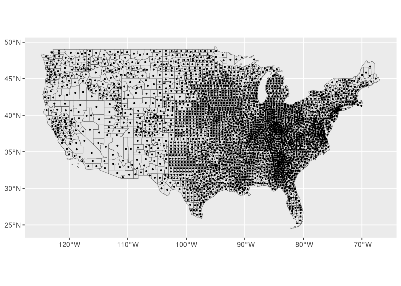
- Finally, we can also operate together with vector and raster files. The most common operation is to project the raster values on a particular administrative division of the space. For example, calculate the average pollution by county in February 2020. Although
terrahas a function to do that (extract) it is typically slow for large data. Instead, we are going to use theexactextractrpackage
require(exactextractr)
pollution_agg <- exact_extract(r2020Feb,counties_wgs84,fun="mean",progress=FALSE)
counties_wgs84 <- counties_wgs84 |> mutate(pollution_avg=pollution_agg)
counties_wgs84 |> st_drop_geometry() |>
  select(NAME,STATE_NAME,pollution_avg) |>
  arrange(-pollution_avg) |> head()
NAME STATE_NAME pollution_avg
1 Douglas Oregon 12.11970
2 Lane Oregon 11.57810
3 Merced California 11.57619
4 Plumas California 11.52085
5 Sierra California 11.51303
6 Stanislaus California 11.50792Visualization of geographical information
We saw some libraries to visualize geographical information: ggplot to produce static visualizations and leaflet and mapview for interactive visualizations with automatic basemaps. The latter are typically better but require more computational resources, so they are slow for big data.
There are many options in those libraries to customize our visualization. For example, we can change the colors, add different layers, legends, etc. Here, we are going to exemplify this by creating a choropleth visualization. A choropleth is an easy way to visualize how a variable varies across geographical areas by changing the color or transparency of those geographical areas. You can see them everywhere, in newspapers and reports. Here are the 2016 elections by district from this NYTimes article:
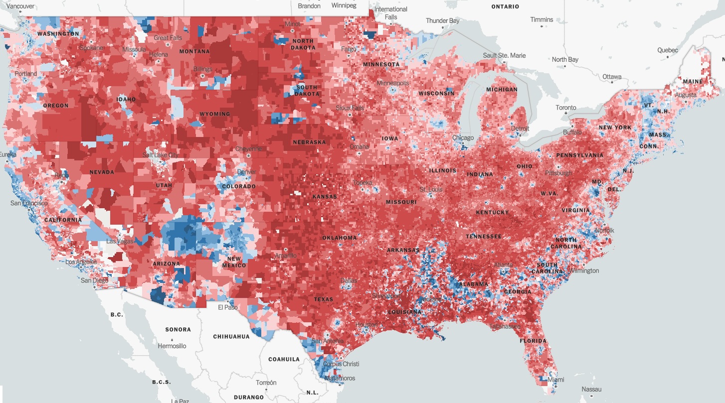
Caution should be taken when using this kind of visualization. Choropleths are prone to misinterpretation when areas are not uniform in size (the “Alaska effect”) giving more importance to larger areas which typically are less populated (see a good example above!).
Let’s use a choropleth to show the median household income by county in Massachusetts.
GEOID_MA <- counties_wgs84 |> filter(STUSPS=="MA") |> pull(GEOID)
counties_MA <- counties_income |> filter(GEOID %in% GEOID_MA)
To do that in leaflet we have to define a palette of colors proportional to income and use it to fill the polygons
pal <- colorNumeric("YlOrRd",domain=counties_MA$medincomeE)
leaflet(counties_MA) |>
  addPolygons(fillColor = ~ pal(medincomeE),
              weight=2,
              opacity=0.5,
              color="white",
              fillOpacity = 0.5)
Let’s add some interaction
leaflet(counties_MA) |>
  addPolygons(fillColor = ~ pal(medincomeE),
              weight=2,
              opacity=0.5,
              color="white",
              fillOpacity = 0.5,
              label = ~ paste0(NAME," - $",medincomeE)
  )
Some basemaps and a legend
leaflet(counties_MA) |>
  addProviderTiles(provider=providers$CartoDB.DarkMatter) |>
  addPolygons(fillColor = ~ pal(medincomeE),
              weight=2,
              opacity=0.5,
              color="white",
              fillOpacity = 0.5,
              label = ~ paste0(NAME," - $",medincomeE)
  ) |>
  addLegend(pal = pal, values = ~medincomeE, opacity = 0.7, title = NULL,
  position = "bottomright")
In mapview is a little bit easier. We just have to specify a zcol
mapview(counties_MA, zcol="medincomeE")Exercise 4
Using a choropleth, visualize the pollution by county in mainland U.S.
More information
We just scratched the surface of using R to use geographical information. Here are more resources:
- Geocomputation with R book by Lovelace et al.
- Spatial Data Science with applications in R book by Pebesma and Vivand.
- Geospatial Analysis Made Easy: A Beginner’s Guide to RStudio by Bhandari
sfpackage webpage- Spatial manipulation with
sf, cheat sheet.
References
[1]
A. van Donkelaar et al., “North american fine particulate matter chemical composition for 2000–2022 from satellites, models, and monitors: The changing contribution of wildfires,” ACS ES&T Air, 2024.