library(tidyverse)
library(arrow) # for efficient dataframes
library(DT) # for interactive tables
library(knitr) # for tables
library(ggthemes) # for ggplot themes
library(sf) # for spatial data
library(tigris) # for US geospatial data
library(tidycensus) # for US census data
library(stargazer) # for tables
library(leaflet) # for interactive maps
library(igraph) # for network analysis
library(ggraph) # for network visualization
set.seed(12345) # for reproducibility
options(tigris_use_cache = TRUE) # use cache for tigris
theme_set(theme_hc() + theme(axis.title.y = element_text(angle = 90))) Lab 11-1 - Epidemics using ABMs
Objectives
In this lab, we will use Agent-Based Models (ABMs) to understand the evolution of epidemics in urban areas. We will use a simple agent model to model people’s mobility in urban areas leading to contacts between them and simulate a simple SIR model over that network of contacts. In particular, we will
- Use individual mobility data to model the mobility of agents in the city and the contacts between them.
- A simple SIR model will be used to simulate the spread of diseases in the city.
- Analyze the dynamics of the spread of diseases in the city and the impact of the different places in the propagation of the epidemic.
- Simulate different non-pharmaceutical interventions to control the spread of diseases in the city.
Load some libraries and settings we will use
Agent-based model
To simulate the spread of diseases in cities, we define a simple agent-based model. In this model:
- Agents move around the city visiting different POIs.
- As a result of that mobility, agents can get in contact / exposure with other agents in particular POIs.
- Agents can infect each other when they encounter.
- We will discard home infection, although it can be included in the model.
Mobility
Each agent has a particular type of mobility, visiting different POIs in the city during the day. Agents’ mobility can be modeled in two different ways:
- The mobility of agents can be modeled using a simple decision-making model, for example, using the Exploration and Preferential Return model using gravity models to visit new places.
- Mobility of agents can also be data-driven modeled:
- We can use actual mobility data from aggregated flows (Advan) and generate random walks using those flows,
- Agent mobility can be taken directly from individual mobility data (Cuebiq).
Epidemic model
We will use a simple SIR model to simulate the spread of diseases in the city. In this model, agents can be in three states:
- Susceptible (S): agents that can be infected.
- Infected (I): agents that are infected and can infect others.
- Recovered (R): recovered agents that cannot be infected again.
The dynamics of the model are simple:
\[ \begin{aligned} S & \xrightarrow{\beta} I \\ I & \xrightarrow{\gamma} R \end{aligned} \]
where:
- Susceptible agents \(S\) can be infected when they encounter an infected agent \(I\) in a POI with probability \(\beta\). We will assume that the probability is constant across all POIs.
- Infected agents recover at rate \(\gamma\). For simplicity, we will assume that agents recover after a fixed number of days (\(1/\gamma\)). After recovery, agents get immunized and cannot be infected again.
Data-drive Agent-Based model
Since we have the individual mobility data for 10k users in the Boston MSA, instead of modeling the mobility of the agents, we will use a data-driven approach to simulate their mobility.
visits <- read_csv("/data/CUS/mob10kusers.csv")On the other hand, we will simulate the epidemics using a simple SIR model. We will only consider that this is possible if users spend more than 5 minutes in a given POI so there is enough time for epidemic contact.
visits <- visits |>
  filter(DWELL_TIME_MINUTES >= 5 & DWELL_TIME_MINUTES <= 60*4)
ABM simulation of epidemics
To simulate the epidemics, we need to identify when users get in contact. For simplicity, we will assume that if two users spent some time in a given POI on the same day, there is a contact between them. This condition can be strengthened by requiring that users spend time in the same POI simultaneously.
Here is the list of days:
days <- unique(as.Date(visits$TIME)) |> sort()For example, this is the table with the number of contacts on the first day
vv <- visits |> filter(as.Date(TIME) == days[1])
contacts <- vv |>
      inner_join(vv, by = c("VISIT_CBG" = "VISIT_CBG", "ACTIVITY" = "ACTIVITY"),
                 relationship = "many-to-many") |>
      filter(USER.x != USER.y) |>
      dplyr::select(USER.x, USER.y, VISIT_CBG, ACTIVITY)
contacts |> head()
# A tibble: 6 × 4
USER.x USER.y VISIT_CBG ACTIVITY
<dbl> <dbl> <chr> <chr>
1 8210 7851 MA0173537004 Service
2 8210 4881 MA0173537004 Service
3 8210 3486 MA0173537004 Service
4 1297 2373 MA0250912002 Grocery
5 9346 801 MA0173324002 Shopping
6 9346 2761 MA0173324002 ShoppingNote that, as we did in previous labs, we are considering the pair VISIT_CBG and ACTIVITY to identify the POI. This is a simplification, but it is enough for our purposes.
The table contacts contains the daily contact network in the city of those 10k agents.
contact_network <- graph_from_data_frame(contacts, directed = FALSE)Here is the graph
contact_networkIGRAPH c48c1d6 UN-- 6328 190972 --
+ attr: name (v/c), VISIT_CBG (e/c), ACTIVITY (e/c)
+ edges from c48c1d6 (vertex names):
[1] 8210--7851 8210--4881 8210--3486 1297--2373 9346--801 9346--2761
[7] 9346--6657 9346--839 9346--4266 9346--2158 9346--1176 9346--8604
[13] 9346--7260 9346--7320 9346--2853 9346--1933 9346--2405 9346--627
[19] 9346--6113 9346--4064 9346--5670 9346--3338 9346--8554 9346--3338
[25] 9346--3338 9346--4172 9346--1184 9346--6113 9346--3336 9346--7846
[31] 9346--3411 9346--3701 9346--7069 9346--548 9346--2037 9346--5767
[37] 9346--7069 9346--7320 9346--6778 9346--8036 9346--9975 9346--7199
[43] 9346--2037 9346--3130 9346--759 9346--4981 9346--2037 9346--9576
+ ... omitted several edgesContacts are very heterogeneous, with some users having many contacts and most of them having few contacts.
contact_network |> degree() |> enframe() |>
  ggplot(aes(value)) +
  geom_density(fill="lightgray",alpha=0.5) +
  scale_x_log10() +
labs(x="#Contacts", y="Density") 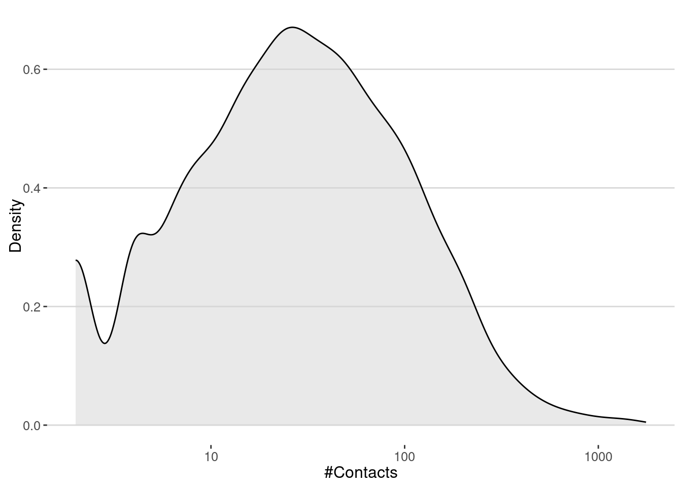
The number of contacts is a key factor in understanding how diseases spread in a city. In epidemiology, the basic reproduction number, \(R_0\), represents the average number of secondary infections caused by one infected individual in a fully susceptible population.
Formally, \(R_0 \approx \beta \times \langle k \rangle \times D\), where - \(\beta\) is the transmission probability per contact, - \(\langle k \rangle\) is the average number of contacts per individual, - \(D\) is the duration of infectiousness.
In our case, we can calculate the average number of contacts in the contact network using the degree of the nodes, which represents the number of contacts each agent has.
cat("<k> = ",mean(degree(contact_network)),"\n")<k> = 60.35777 Thus, if we make the simple assumption that the number of secondary cases on average is \(R_0 = \langle k \rangle \beta\) (i.e. \(D=1\)), we can estimate that the critical transmission probability of a pandemic in our contact network is
cat("Critical transmission probability, beta_c =",1/mean(degree(contact_network)),"\n")Critical transmission probability, beta_c = 0.01656787 Simulate the spread of diseases
To simulate the spread we will use the following algorithm:
- First we simulate the transmission of the disease from \(I \to S\). To do that we get all the contacts at day \(t\), get only the ones between \(S\) and \(I\) groups and sample them with probability \(\beta\) to get the infection events. If
old_infectedandold_susceptibleare the sets of infected and susceptible agents at day \(t\), we can get the transmission events as follows:
beta = 0.03
transmission <- contacts |> sample_n(beta*nrow(contacts)) |>
  filter((USER.x %in% old_infected & USER.y %in% old_susceptible) |
         (USER.y %in% old_infected & USER.x %in% old_susceptible)
)- The new infected agents are
new_infected <- unique(c(transmission$USER.x, transmission$USER.y))
new_infected <- new_infected[!new_infected %in% old_infected]
After that, we can check how long a node has been infected and if it is time to recover it to implement the \(I \to R\) transition.
We repeat this process for another day until there is no longer any agent in the infected state.
Let’s put all together in a function that simulates the spread of diseases in the city from a table of visits. This function returns two tables:
table_usersincludes the final information for all agents: their final status and the time of infection.transmission_tablehas all the transmission \(S \to I\) events, including the origin of infection, the time, and the place of the infection.
gen_epidemic <- function(visits, ini.infected = 10,
                         beta = 0.03,r.days=7,
                         cats.excluded = ""){

  #exclude visits to certain categories
  visits <- visits |> filter(! ACTIVITY %in% cats.excluded) |>
    mutate(TIME = as.Date(TIME))
  #get the unique days
  days <- unique(visits$TIME) |> sort()

  #initialize the status of each user on the first day
  #all users are susceptible and ini.infected of them are infected
  table_users <- tibble(
    USER = unique(visits$USER), STATUS = "S", TINF = NA
  )
  infected <- sample(table_users$USER, ini.infected)
  table_users <- table_users |>
    mutate(STATUS = if_else(USER %in% infected, "I", STATUS),
           TINF = if_else(USER %in% infected, as.Date(days[1]), TINF))

  transmission_table <- data.frame()
  new_infected <- infected

  #loop over the rest of the days
  for(i in 2:length(days)){
    #select the visits today
    vv <- visits |> filter(TIME == days[i])

    #this is the group in the infected "I" status and the susceptible "S" status
    old_infected <- table_users$USER[table_users$STATUS == "I"]
    old_susceptible <- table_users$USER[table_users$STATUS == "S"]

    #### S -> I ####
    #get the contacts between users in the same CBG and ACTIVITY pairs
    contacts <- vv |>
      inner_join(vv, by = c("VISIT_CBG" = "VISIT_CBG", "ACTIVITY" = "ACTIVITY"),
                 relationship = "many-to-many") |>
      filter(USER.x != USER.y) |>
      dplyr::select(USER.x, USER.y, VISIT_CBG, ACTIVITY)

    #Those contacts transmit the disease with probability beta
    transmission <- contacts |> sample_n(beta*nrow(contacts)) |>
      filter((USER.x %in% old_infected & USER.y %in% old_susceptible) |
             (USER.y %in% old_infected & USER.x %in% old_susceptible)) |>
      mutate(TIME = days[i])

    #get the new infected
    new_infected <- unique(c(transmission$USER.x, transmission$USER.y))
    new_infected <- new_infected[!new_infected %in% old_infected]

    #order the transnmission event and keep only the first transmission
    #between users
    transmission <- transmission |>
      mutate(user_i = if_else(USER.x %in% old_infected, USER.x, USER.y),
             user_s = if_else(USER.x %in% old_infected, USER.y, USER.x)) |>
      arrange(user_s) |> distinct(user_s,.keep_all = TRUE) |>
      dplyr::select(user_i,user_s,TIME,VISIT_CBG,ACTIVITY)

    #add the new transmission events to the table
    transmission_table <- rbind(transmission_table,transmission)

    #update the status of the users for the infections
    if(length(new_infected) > 0){
      table_users <- table_users |>
        mutate(STATUS = if_else(USER %in% new_infected, "I", STATUS),
               TINF = if_else(USER %in% new_infected, as.Date(days[i]), TINF))
    }

    #### I -> R
    # update the status of the users for the recoveries
    table_users <- table_users |>
      mutate(STATUS =
               if_else(STATUS == "I" & TINF + r.days <= days[i], "R", STATUS))

  }
  return(list(transmission_table=transmission_table,
              table_users=table_users))
}
Epidemic spreading without interventions
Let’s simulate the spread of diseases in the city without any intervention. We will use the function gen_epidemic to simulate the spread of diseases in the city.
set.seed(123)
epidemic_no_NPI <-
  gen_epidemic(visits,
               ini.infected = 10,
               beta = 0.03,
               cats.excluded = "")
Here is the number of cases by day
cases_epidemic_no_NPI <-
  epidemic_no_NPI$table_users |>
  filter(!is.na(TINF)) |>
  count(TINF)
ggplot(cases_epidemic_no_NPI,aes(x=TINF,y=n)) +
  geom_line() +
  labs(x="Date",y="Number of cases")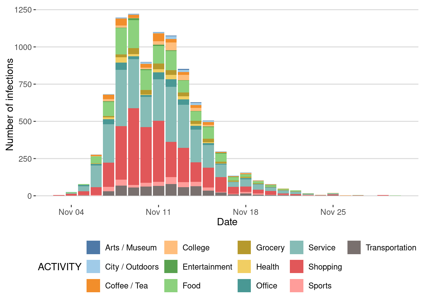
Note that the epidemic stops not because of any intervention, but because the number of potential infections (number of remaining susceptible people) decreases as the epidemic spreads. This is a key feature of epidemics, which is the emergence of herd immunity when a large fraction of the population has been infected and recovered.
Let’s plot it
epidemic_no_NPI$table_users |>
  filter(!is.na(TINF)) |>
  count(TINF) |>
  mutate(cumulative = cumsum(n)) |>
  ggplot(aes(x=TINF,y=cumulative)) +
  geom_line() +
  geom_hline(yintercept = nrow(epidemic_no_NPI$table_users), linetype="dashed", color="red") +
  labs(x="Date",y="Cumulative number of cases")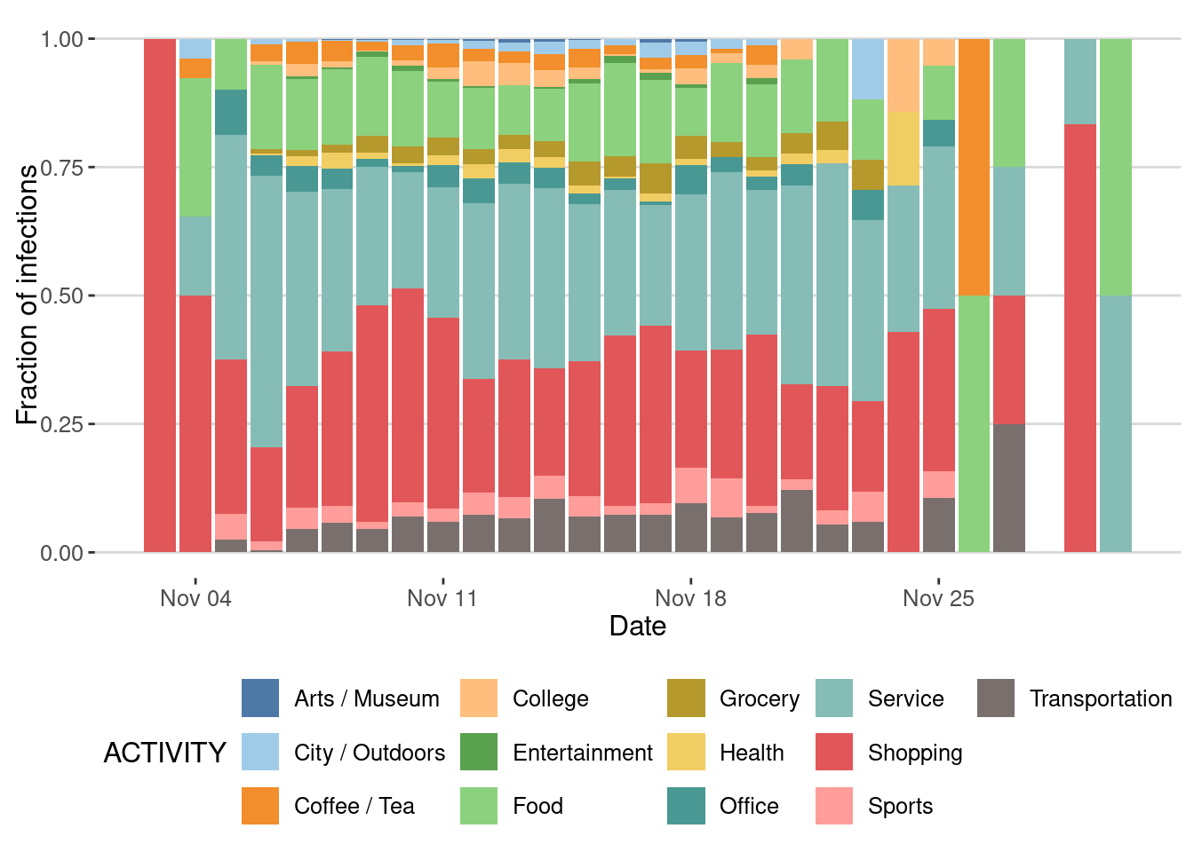
Impact of type of places on the epidemic spreading
We can also investigate the places where most transmissions took place
ggplot(epidemic_no_NPI$transmission_table) +
  geom_bar(aes(x=TIME,y=after_stat(count),fill=ACTIVITY),
           stat="count",position="stack") +
  scale_fill_tableau(palette = "Tableau 20")+
  labs(x="Date",y="Number of infections")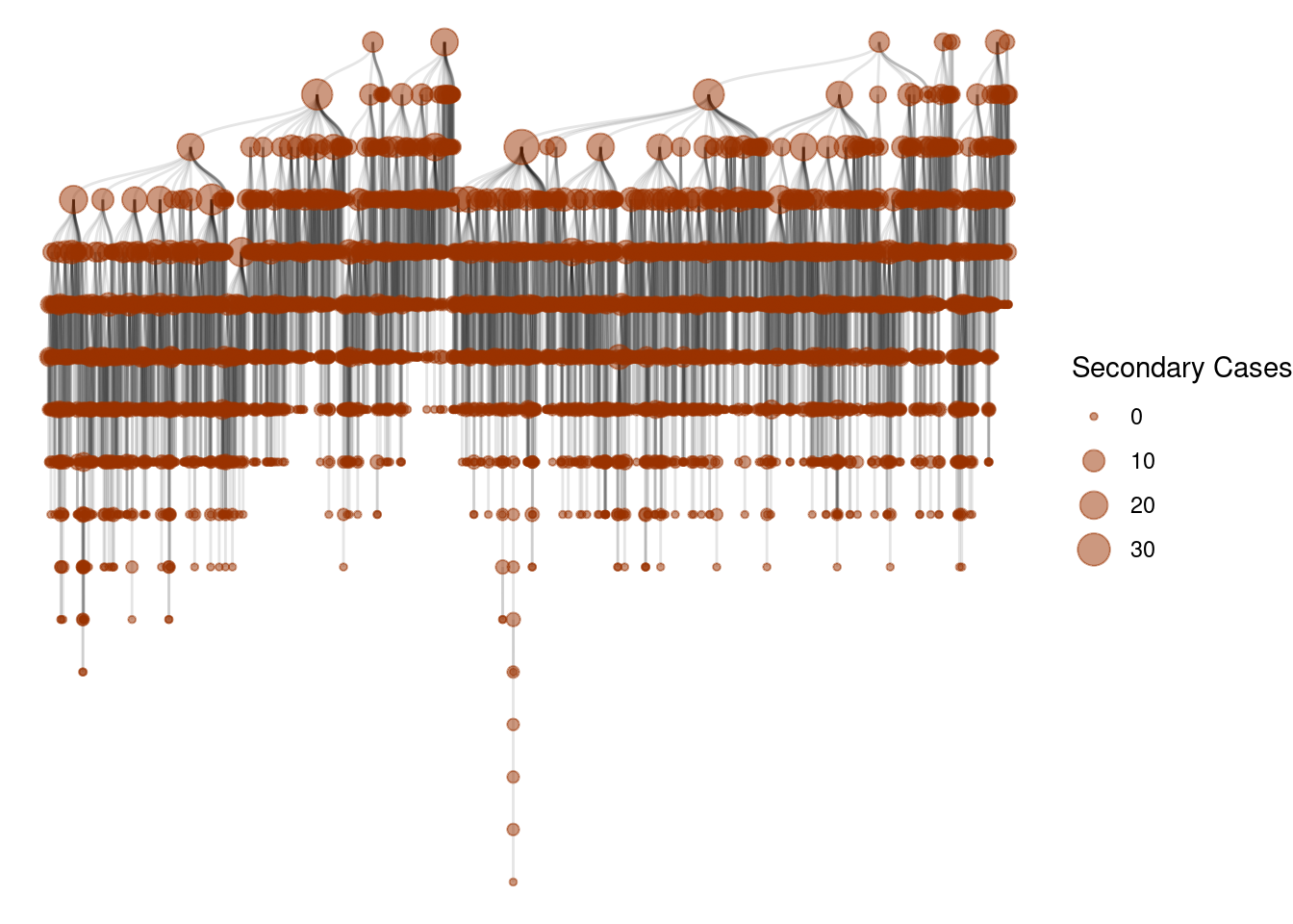
Or by fraction
ggplot(epidemic_no_NPI$transmission_table) +
  geom_bar(aes(x=TIME,y=after_stat(count),fill=ACTIVITY),
           stat="count",position="fill") +
  scale_fill_tableau(palette = "Tableau 20")+
  labs(x = "Date",y ="Fraction of infections")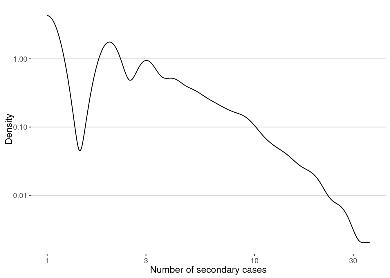
As we can see, most of the transmission events happened in Shopping and Service places.
Super-spreading events
One of the key signatures of different epidemic processes is the presence of super-spreading events [1]. These events are characterized by a single individual infecting a large number of other individuals.
Let’s see those events as a cascade of infections:
g <- graph_from_data_frame(epidemic_no_NPI$transmission_table, directed=T)
ggraph(g, layout = 'tree') +
  geom_edge_diagonal(alpha=0.1) +
  geom_node_point(aes(size=degree(g,mode="out")),
                  col=rgb(0.6,0.2,0,0.5))+
  scale_size(name="Secondary Cases") +
  theme_void()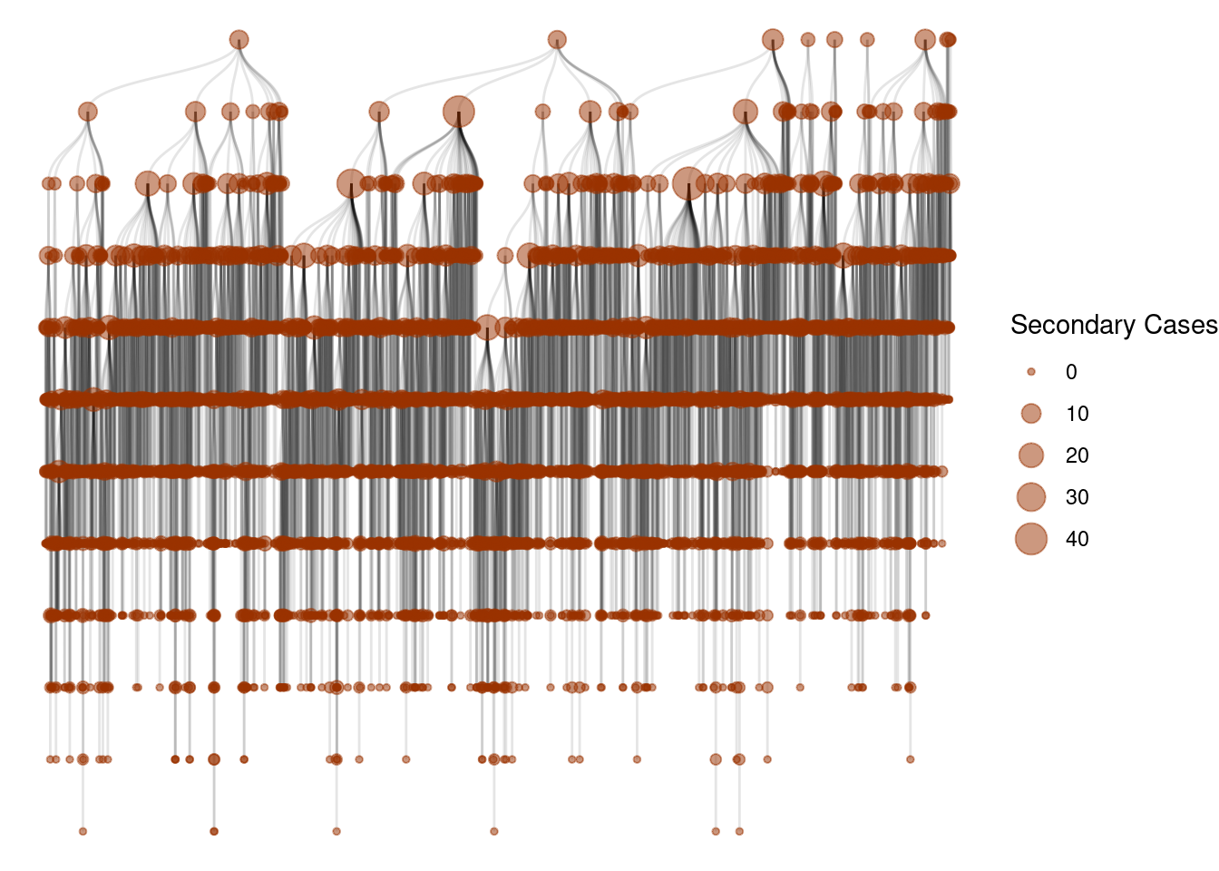
And this is the distribution
secondary_cases <- epidemic_no_NPI$transmission_table |>
  group_by(user_i) |>
  count() |> pull(n)
ggplot(data.frame(sc=secondary_cases),aes(x=sc)) +
  geom_density(color="black") +
  scale_x_log10() + scale_y_log10() +
  labs(x="Number of secondary cases",y="Density")
The average of secondary cases is the famous \(R_0\) of the epidemic. In our case we get:
cat("R0 = ",mean(secondary_cases),"\n")R0 = 2.218334 A better view of the epidemic process is to look at the distribution of secondary cases at different times
secondary_cases_time <- epidemic_no_NPI$transmission_table |>
  group_by(TIME,user_i) |>
  count() |>
  group_by(TIME) |>
  summarise(mean_sc = mean(n), median_sc = median(n),
            q25_sc = quantile(n,0.25), q75_sc = quantile(n,0.75))
Here is the evolution of \(R_0\) (or \(R_t\)) over time:
ggplot(secondary_cases_time,aes(x=TIME,y=mean_sc)) +
  geom_line() +
  geom_ribbon(aes(ymin=q25_sc,ymax=q75_sc),alpha=0.2) +
  labs(x="Date",y="Average number of secondary cases")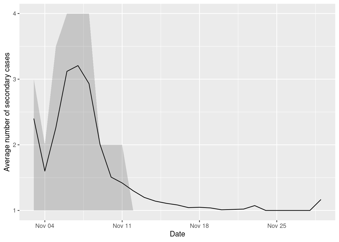
As we can see, the average number of secondary cases decreases over time as the epidemic spreads and the number of susceptible people decreases.
However, the distribution of secondary cases is very heterogeneous, with some users infecting many others, creating those super-spreading events. One way to measure the relevance of superspreading events is to calculate dispersion parameter, \(\kappa\), assuming that the number of secondary cases is distributed like a Negative Binomial [1].
This parameter can be estimated using the moments of the distribution. If the number of secondary cases \(r_i\) generated by each infected individual \(i\) then \[ \kappa = \frac{ \overline{r_i}^2}{Var(r_i) - \overline{r_i}} \] Here is the function to calculate it:
dispersion <- function(sec_cases){
  mean_x <- mean(sec_cases)
  var_x <- var(sec_cases)
  mean_x^2 /(var_x-mean_x)
}
In our case we get
cat("Dispersion parameter, k =",dispersion(secondary_cases),"\n")Dispersion parameter, k = 1.475766 More formally, we can fit the distribution to a Negative Binomial and get the dispersion parameter directly
library(MASS)
fit <- fitdistr(secondary_cases, "Negative Binomial")
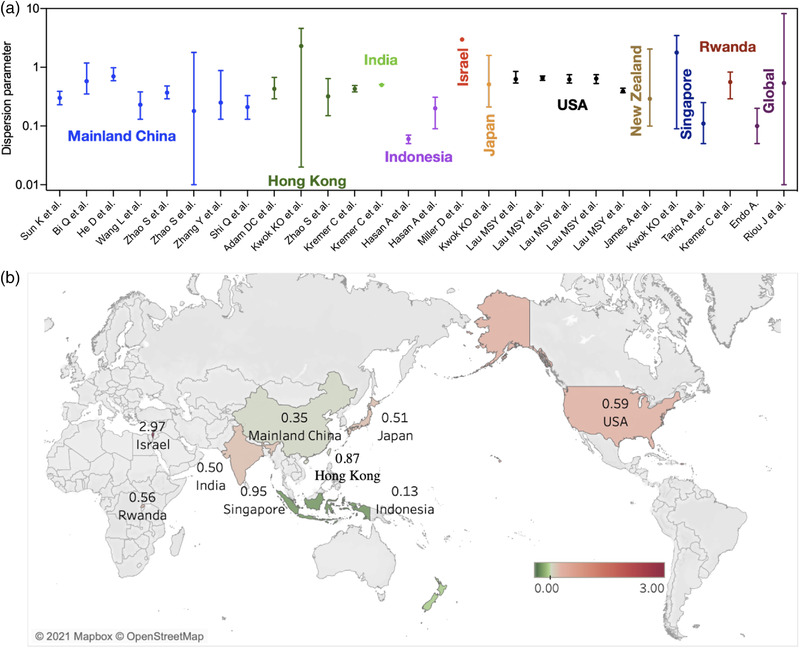
cat("Dispersion parameter, k = ",fit$estimate["size"],"\n")Dispersion parameter, k = 3.825672 You can compare it to different measures of dispersion coefficient with epidemics, like COVID-19:
Your turn
In a recent paper [3], Aleta and collaborators simulate different NPI strategies to control the spread of diseases in cities. Use our ABM to implement the following strategies:
- Non-essential business closure: close all non-essential businesses, like restaurants, museums, offices, etc.
- Social distancing: reduce the number of contacts between agents by 50%.
- Quarantine: isolate the infected agents for 14 days.
Reproduce the results above for each of the strategies and compare the impact of each of them on the spread of diseases in the city.
Epidemic spreading with non-essential business closure
For example, this the simulation of the spread of diseases with the non-essential business closure strategy:
set.seed(123)
epidemic_NPI <-
  gen_epidemic(visits,
               ini.infected = 10,
               beta = 0.03,
               cats.excluded = c("Food","Office",
                                 "Arts / Museum",
                                 "Entertainment",
                                 "Sports",
                                 "Shopping"))
and here is the number of cases
cases_epidemic_essential <- epidemic_NPI$table_users |>
  filter(!is.na(TINF)) |>
  count(TINF)
ggplot(cases_epidemic_essential,aes(x=TINF,y=n)) +
  geom_line() +
  labs(x="Date",y="Number of cases")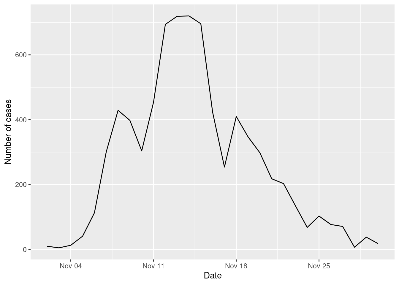
Compare the number of cases with and without the NPI
cases_epidemic_no_NPI |>
  mutate(NPI = "No NPI") |>
  bind_rows(cases_epidemic_essential |>
              mutate(NPI = "Essential closure")) |>
  ggplot(aes(x=TINF,y=n,color=NPI)) +
  geom_line() +
  labs(x="Date",y="Number of cases")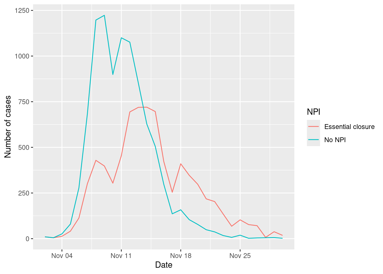
As we can see the non-essential business closure strategy has a significant impact on the spread of diseases in the city, reducing the number of cases significantly in the peak. This is the “flattening the curve” strategy, which is based on reducing the number of contacts between agents to reduce the spread of diseases and avoid overwhelming the healthcare system.
However, it is important to note that this strategy has a significant economic and social impact, so it should be implemented with caution.
Conclusions
Using ABMs we can simulate the spread of diseases in cities and understand the impact of different interventions on the spread of diseases. In particular, we can understand the importance of super-spreading events and the impact of different places on the spread of diseases.
Agents’ mobility can be defined by simple individual models, like EPR, but also we can use data-driven models to simulate the mobility of agents in the city.
ABMs can help us understand the emergence of epidemic patterns from micro-decisions of agents and the impact of different interventions on the spread of diseases in cities.
Further reading
The Idea of Agent-Based Modeling by Gilbert, in the SAGE Research Methods Book on Agent-Based Modeling [4]
Agent-Based Modeling and the City: a gallery of applications by Crooks et al [5]
Modelling the impact of testing, contact tracing and household quarantine on second waves of COVID-19 by Aleta et al [3]
References
[1]
J. O. Lloyd-Smith, S. J. Schreiber, P. E. Kopp, and W. M. Getz, “Superspreading and the effect of individual variation on disease emergence,” Nature, vol. 438, no. 7066, pp. 355–359, Nov. 2005, doi: 10.1038/nature04153.
[2]
Z. Du et al., “Systematic review and meta‐analyses of superspreading of SARS‐CoV‐2 infections,” Transboundary and Emerging Diseases, p. 10.1111/tbed.14655, Jul. 2022, doi: 10.1111/tbed.14655.
[3]
A. Aleta et al., “Modelling the impact of testing, contact tracing and household quarantine on second waves of COVID-19,” Nature Human Behaviour, vol. 4, no. 9, pp. 964–971, Sep. 2020, doi: 10.1038/s41562-020-0931-9.
[4]
N. Gilbert, “The Idea of Agent-Based Modeling,” in Agent-Based Models, SAGE Publications, Inc., 2008, pp. 2–21. doi: 10.4135/9781412983259.
[5]
A. Crooks, A. Heppenstall, N. Malleson, and E. Manley, “Agent-Based Modeling and the City: A Gallery of Applications,” in Urban Informatics, W. Shi, M. F. Goodchild, M. Batty, M.-P. Kwan, and A. Zhang, Eds., Singapore: Springer, 2021, pp. 885–910. doi: 10.1007/978-981-15-8983-6_46.